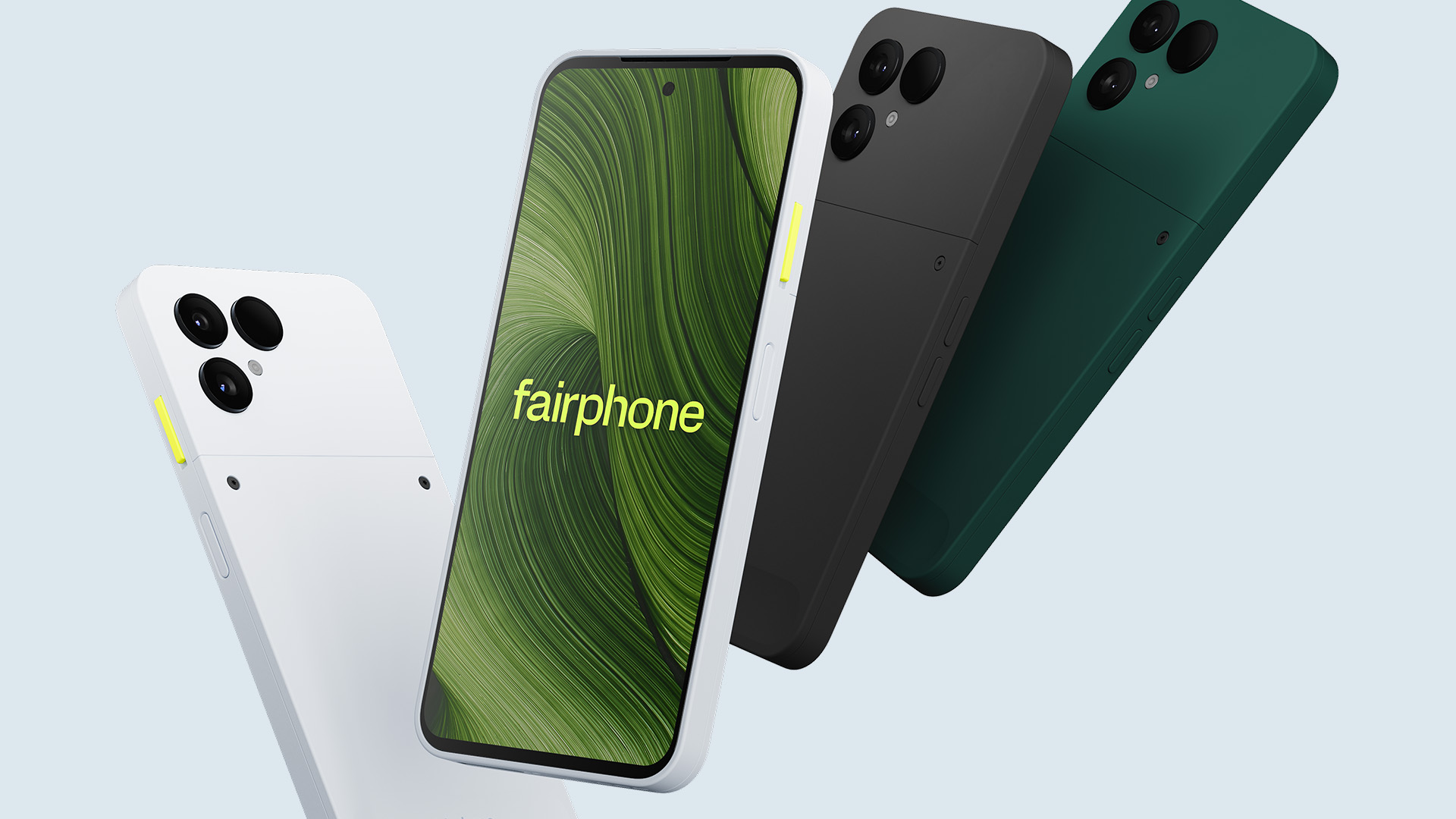
Fairphone Promotional UI
Designed four UI touchpoints to promote a device bundling offer across the Fairphone mobile purchase journey.
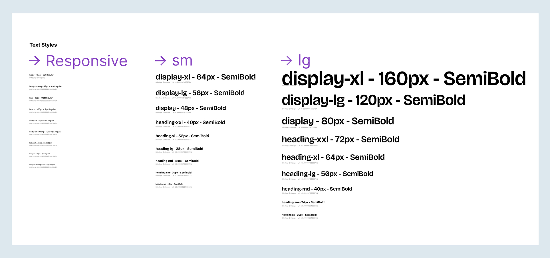
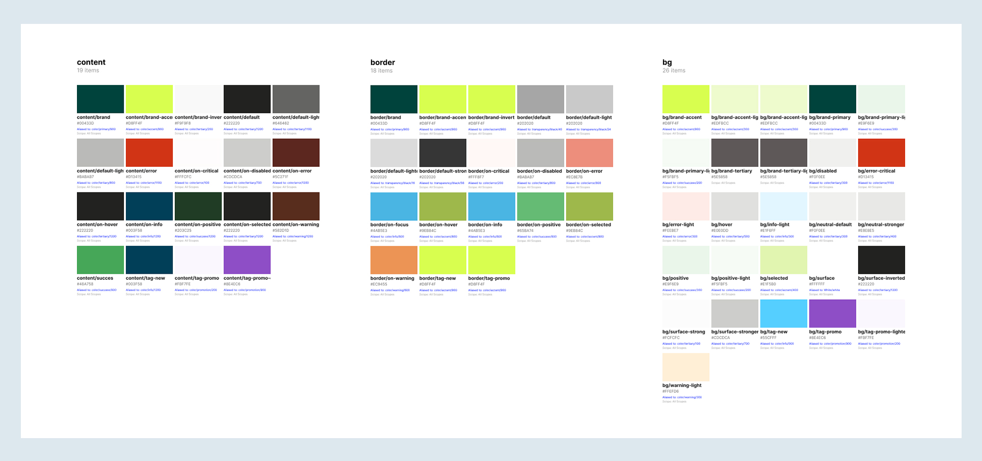
Built entirely within the existing Fairphone design system with every token sourced from the live style guide.
Structured the offer hierarchy so the promotion supports the primary purchase without competing with it.
Delivered a cohesive visual narrative from homepage to cart using Fairphone's lime as a consistent signal.
Problem:
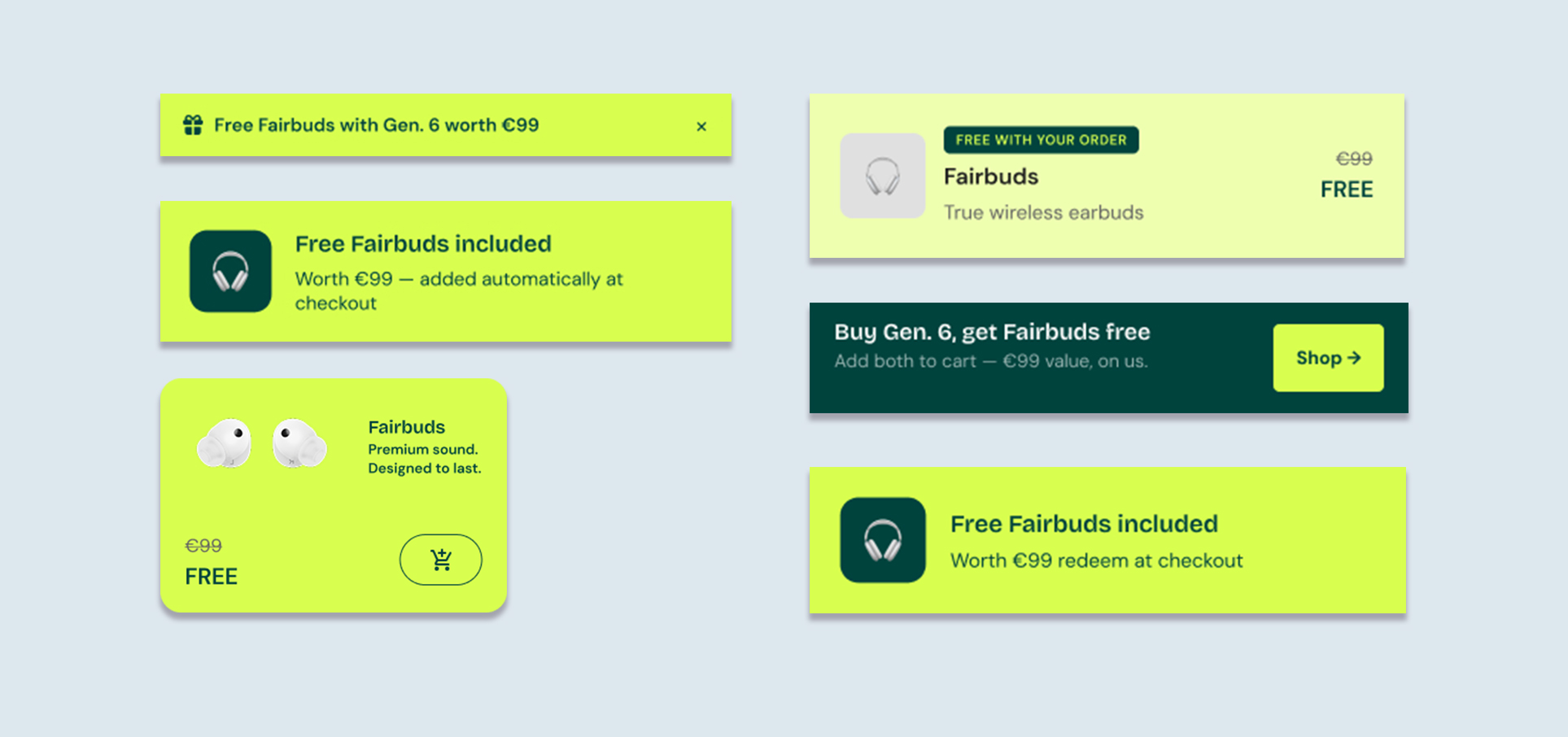
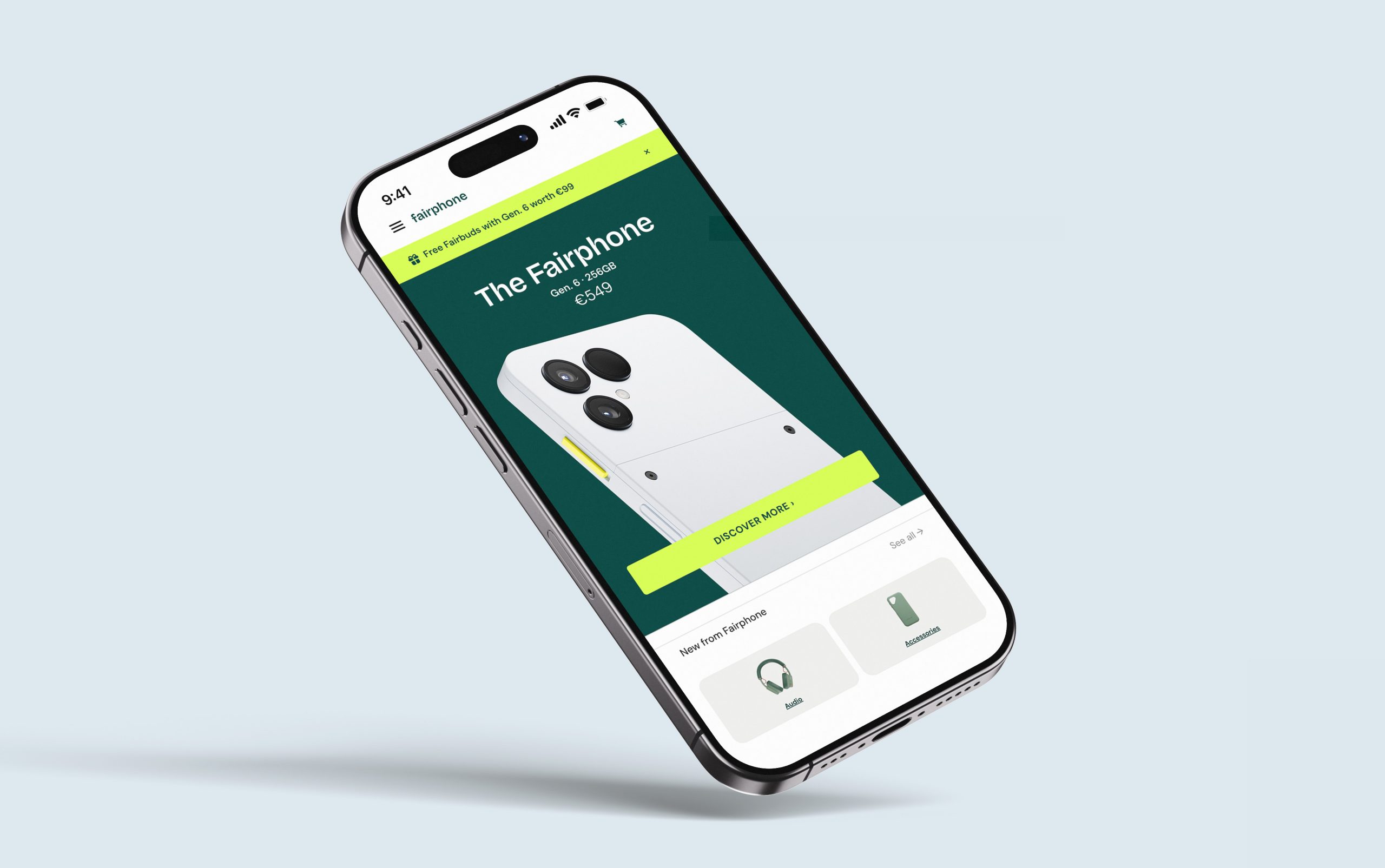
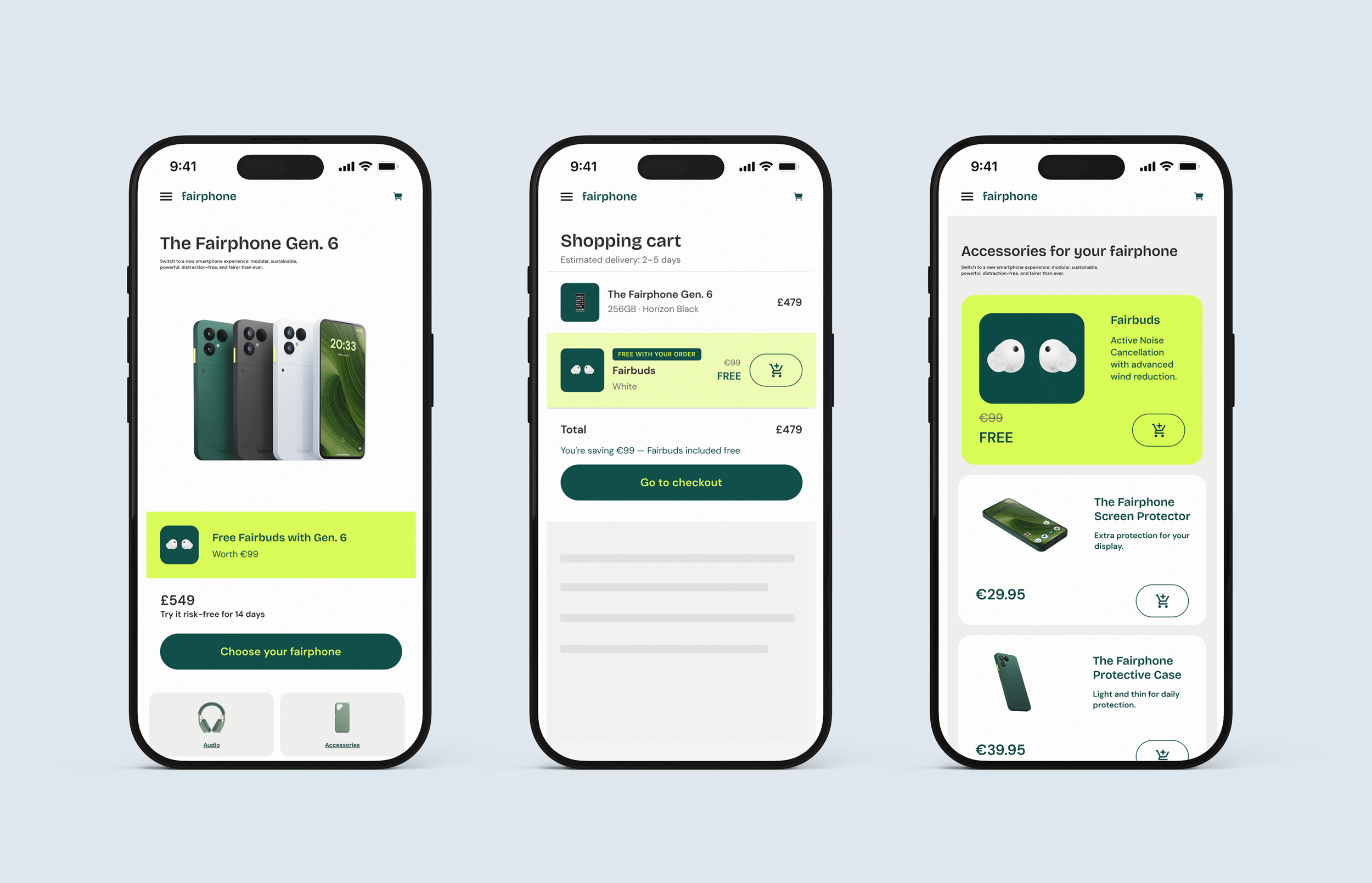
Fairphone needed a way to surface a compelling promotional offer — a free pair of Fairbuds (€99 value) with the purchase of the Gen. 6 — across their mobile commerce experience.
The challenge was visibility without disruption. Promotional UI risks undermining the core purchase flow if it dominates the hierarchy or fragments the visual language. The brief required touchpoints that felt native to the design system, mobile-first in proportion, and persuasive without being pushy.
Approach:
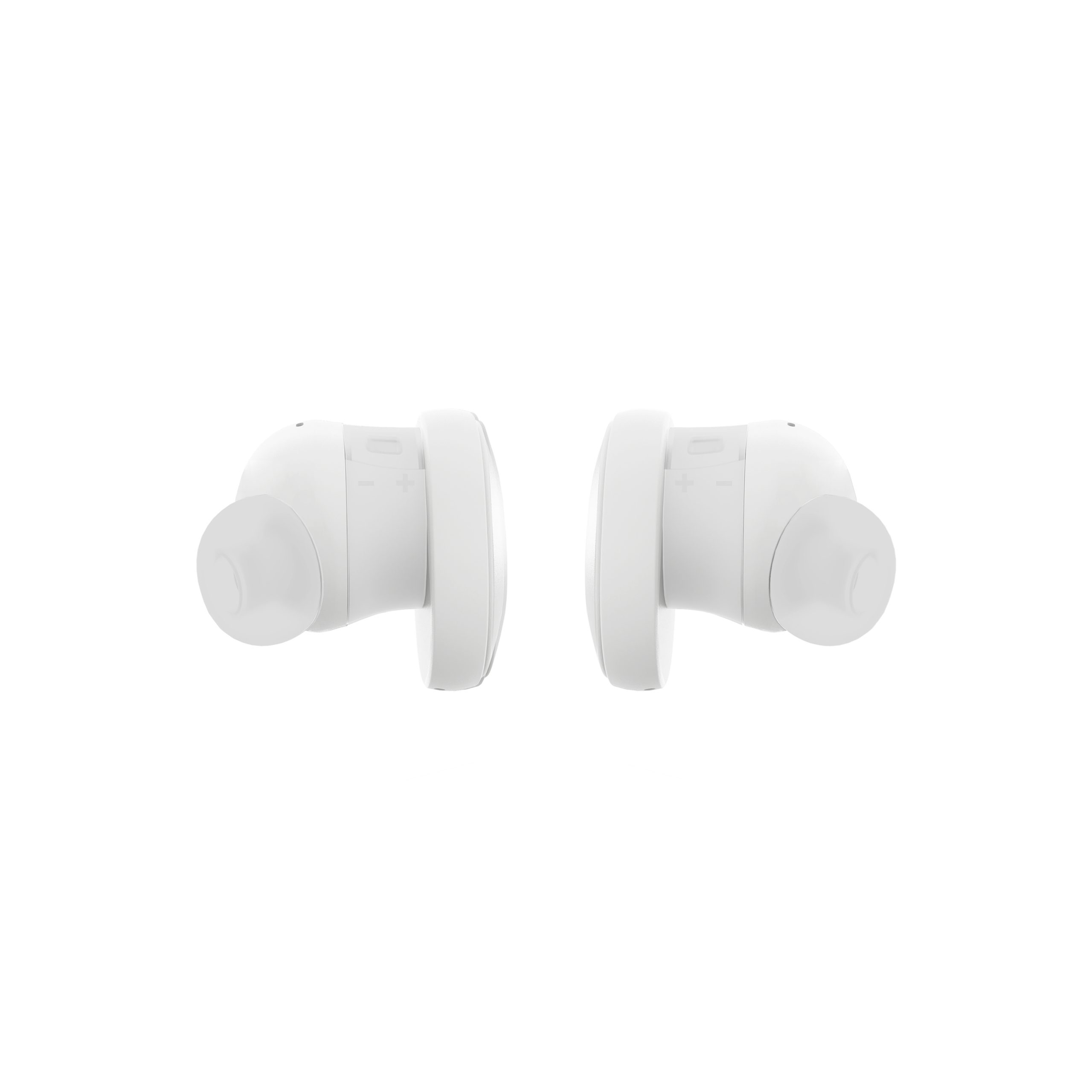
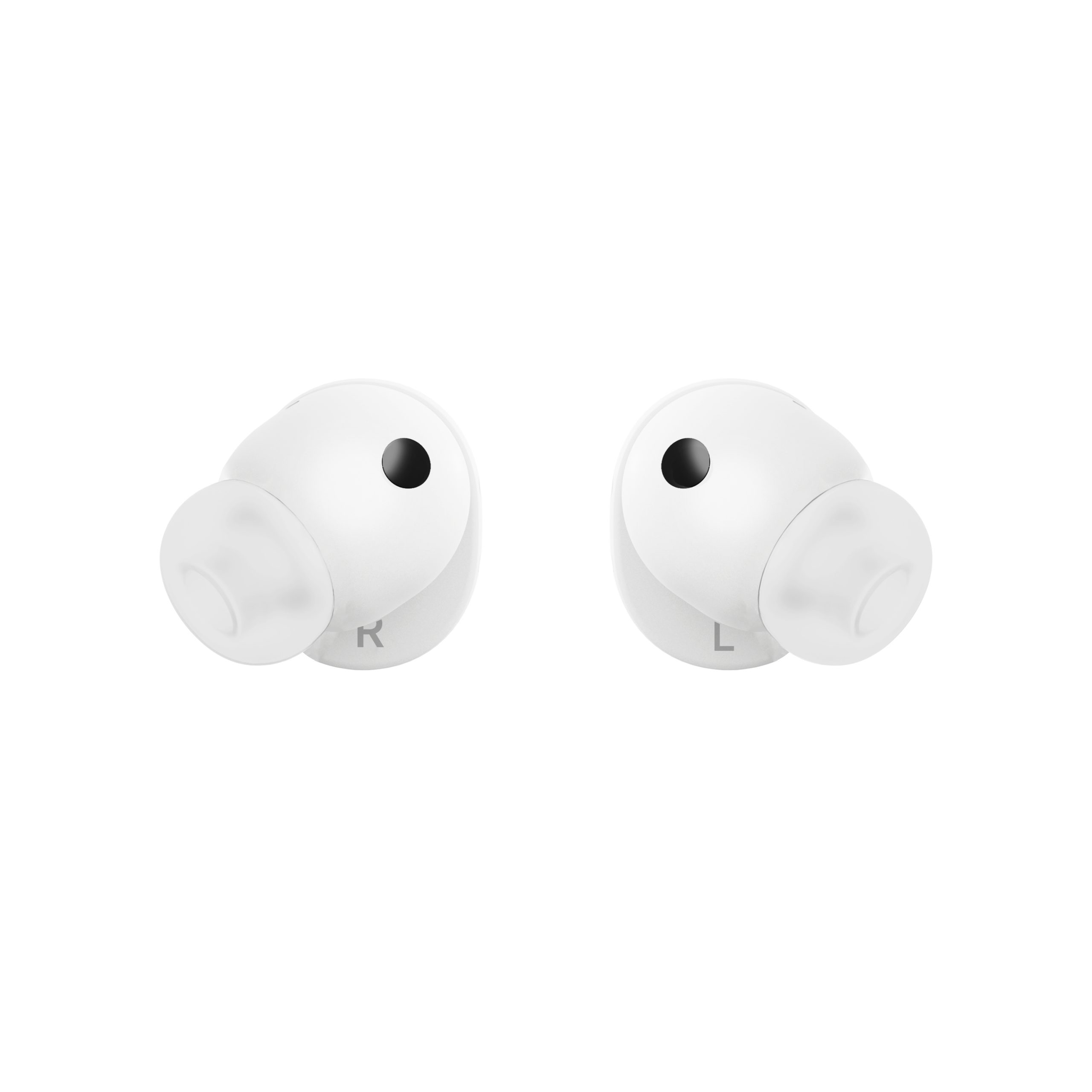
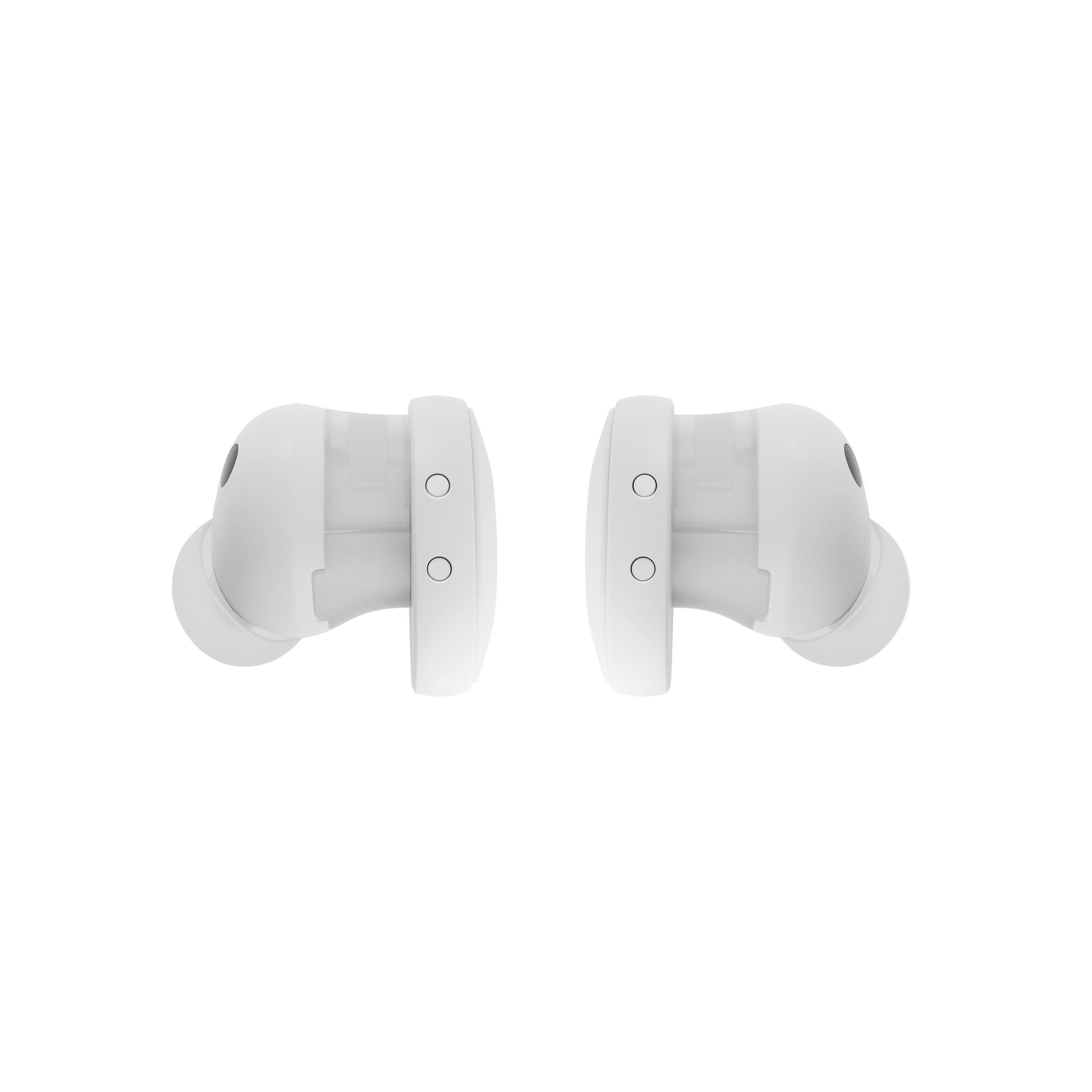
I mapped the offer across four distinct moments in the purchase journey — discovery, consideration, customisation, and commitment — designing a component for each that matched the appropriate level of promotional weight. The homepage banner prioritised reach with minimal visual footprint. The PDP strip introduced the offer before the price anchor, ensuring it read as added value rather than an afterthought. The customisation reminder card gave the Fairbuds space to breathe, using the largest product shot to reinforce the offer at the point of accessory consideration. The cart row kept a passive tone, allowing the user to focus on completing their purchase.
Throughout, I kept the lime highlight colour as the consistent thread — varying its intensity by context to control attention without creating visual noise. All components were designed at mobile proportions with tokens extracted directly from the Fairphone style guide using Figma MCP.

Solution:
Four mobile-first UI components — homepage banner, PDP strip, customisation reminder card, and add-to-cart row — designed to guide users from first awareness of the offer to checkout. The system uses a single brand colour at calibrated intensities to create a visual narrative across the journey without repeating the same pattern mechanically. Each component was scoped to its context: compact and dismissible at the top, richer and more detailed mid-funnel, quiet and confirmatory at the point of purchase. The result is a promotion that feels like part of the product, not bolted onto it.
Luke James Miller Design ©
2025 Amsterdam, The Netherlands
User Experience
User Interface
Product Design
Brand Systems
Email: hello@lukejm.com
IG: @mrlukejm
LinkedIn: @lukejm